The Brief
Our friends at Barnsley & Rotherham Chamber came to us with a clear and detailed brief for a website to replace their existing provision, which they’d just outgrown as a company.
The requirements chiefly comprised of the following:
- Freshly designed and user-friendly interface that works optimally on all devices.
- A revised focus for the site on membership-based content and benefits.
- Increase membership signups.
- Drive traffic to a new membership directory.
- Streamline backend admin systems and management.
Our Approach
The existing site was built on WordPress with additional functionality for a membership directory, ticket sales, and event planning / management.
We wanted to deliver a solution which was familiar the team, but addressed all the shortcomings highlighted in the brief for the frontend interface, as well as easing admin overheads for the team.
Our approach was to deliver this in the following manner:
Content:
The site was extremely heavy on content, a large proportion of this would be changing with a heavy focus-shift / audit. The new site needed to make content extremely quick and easy to manage for the team.
We decided on an approach that clearly separated design / layout from content, the aim being for staff to be able to deliver on-brand content without needing to do any work on styling themselves. We used a Gutenberg block system for this which rigidly adheres to their brand guidelines at all times; the result being a cohesive experience that doesn’t vary depending on page / author etc.
Membership Directory:
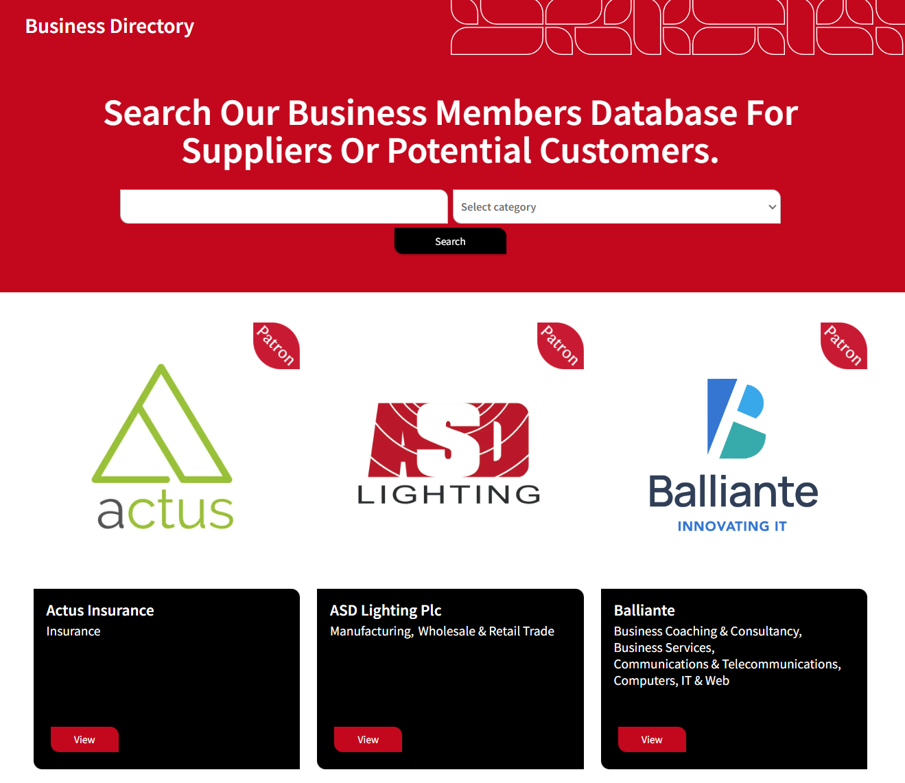
A key feature of the new website is the all-new membership directory. This is a bespoke feature, built from the ground up specifically for the needs of this site.
The purpose of the directory is to give members a platform to showcase their services to other members, building community and trust, in addition to being of huge promotional benefit to members. Members have visibility depending on their membership level and reviews, they’re also rewarded for providing visitors with a rich experience on their membership page. In addition to giving in-depth information on their company offerings, there’s a section to showcase recent work, media videos and testimonials from clients.

From an administration point of view, it was important that the membership system was easier and less time consuming to manage than the previous incarnation. A zero-tolerance approach to any copy/pasting was implemented. The admin interface has management tools designed for seamless management and maintenance.
Automation Features:
The new site has news and events sections, these also allow members to publish their own content here for additional expose and publicity. Previously this was a manual process, however the functionality to contribute is now completely integrated into the membership portal.
Submission of content in this manner is handled on an approval / publish basis as the site generates a fully formatted article / event ready for publication by admin staff.
Membership Focus:
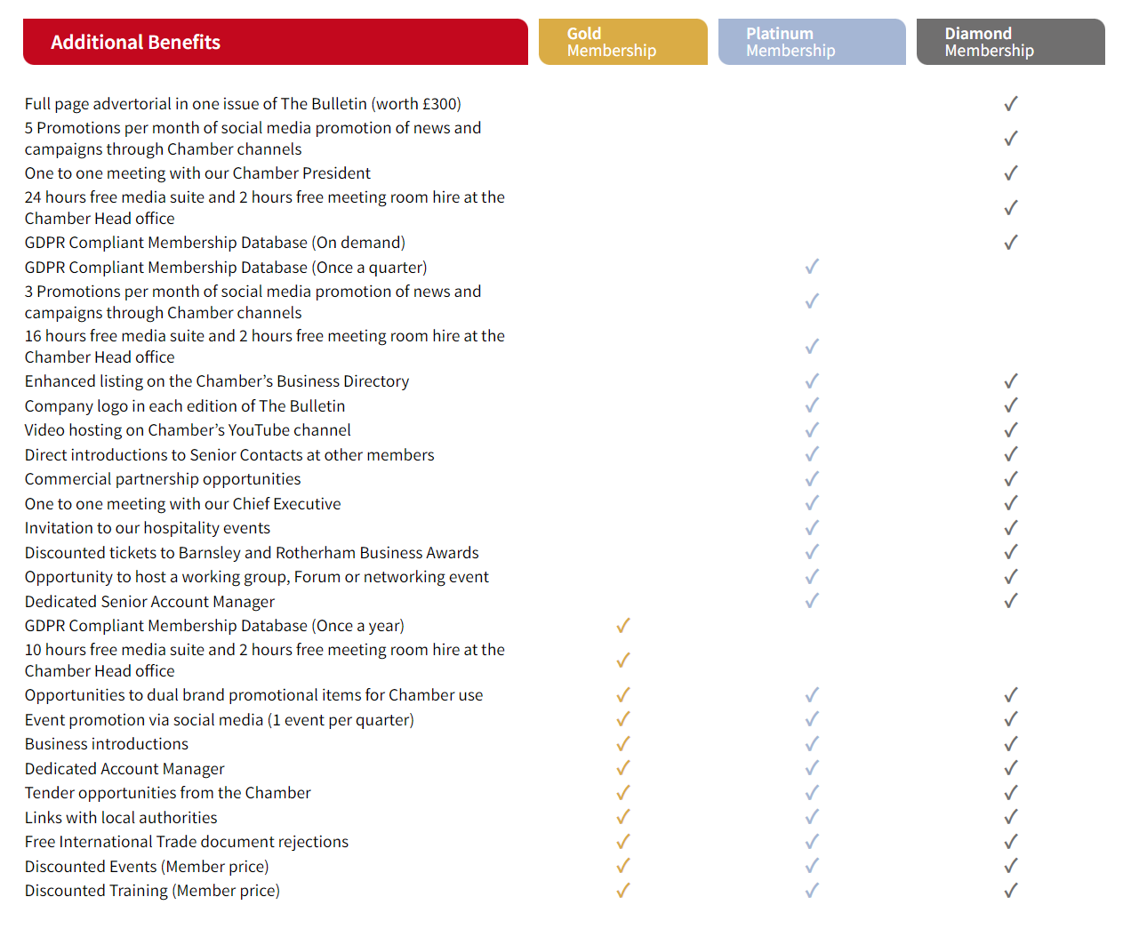
The Chamber has a huge amount of benefits, we wanted to really showcase these to visitors and potential members in a clear and easily digestible fashion. Want to see how many benefits there actually are? Take a look for yourself: https://www.brchamber.co.uk/membership/.

As you can see this is broken down by benefit type and membership level so it’s absolutely clear what sort of return you’d see from membership.

In line with our frontend + backend approach, we designed this complex membership system to be easily managed and on-brand at all times. This approach empowers staff to handle changes going forwards without any intervention from our team, putting them firmly in control of their content.

Results
Although the new site has only recently launched, we’ve observed a large surge of traffic to the membership directory and portal pages as members take advantage of the new system to better publicise their services.
The team at the chamber have always maintain great communication with their members (we’ve been members ourselves for many years!), this new portal is just another string to their bow when it comes to engaging with members and giving them a platform.
We’re looking forward to watching this site evolve. The team are busy working on fresh new content all the time and have a whole raft load of new ideas and projects underway.
Want to find out more about membership? Visit their shiny new website at: https://www.brchamber.co.uk/. Interested in seeing how our approach to websites could benefit your company? Take a look at our Websites page here: https://darkcherrycreative.co.uk/websites/ or get in touch with our team at: https://darkcherrycreative.co.uk/contact.


