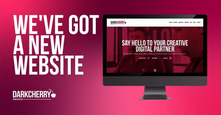
We’re always saying that websites shouldn’t be static documents, frozen in time and a product of a specific timeframe for your company, they should be kept up to date and evolve with your business. If you publish a website and just leave it to its own devices, you’re really under-using its potential.
Say hello to four point oh.
That’s right, this is the 4th version of our site. it was first launched in 2018 when the business was officially formed. We’ve had the following iterations of our site:
- V1: We just need a website.
We had a brand and a logo, we’d worked out our core product offerings and just needed to get the word out. The site was 5 pages and much more simplistic in terms of design. - V2: Let’s showcase our work.
With lots of projects under our belt, we needed to showcase these. The site ran a custom PHP content management system we developed in-house with a PHP7 frontend using the “Mini” framework. More content, project information and we added a blog. The visuals of the site were completely reworked and it featured a new interface. - V3: Better, faster, easier.
The whole site was rewritten again, this time in React / NextJS with a completely new NodeJS content management system (Strapi). It didn’t actually look *that* much different, however it was infinitely faster. All images were optimised on-the-fly and lazy-loaded, blogs and portfolio pages used infinite-scrolling and all pages were statically generated. The whole experience was generally a lot slicker. It was also easier to maintain with the new Strapi V3 CMS. - V4: Prettier and brimming with content.
We had a huge push for overhauling the customer journey and really showcasing exactly what we can do for clients. The whole site was rewritten from the ground up to reflect what we do in 2024. Along the way our design language changed substantially. The colours are reworked and there’s a new gradient. The site is designed completely around the customer experience, show people what they’re looking for and give them the information they need. Under the hood, the site runs React 18 + NextJS 14. The interface has been completely rewritten and built round a modular “block” architecture that gives us a completely dynamic page builder interface on the backend. It’s all new and uses React server components (RSC), static generation and a whole host of new performance optimisations for improved SEO. The CMS is still based on Strapi, although upgraded to the new V4 system.
So what was the goal of all this?
We sat down as a team and worked out exactly what we want our site to do, display and achieve. We decided that on the following goals:
- Better content – more depth and more detail
- Showcase detailed accounts of our successes
- More easily digestible writing style
- Overhauled design language and visual flare
What we came up with was a much larger site, that’s hopefully much nicer for the viewer to digest. It’s also a great opportunity to get creative with animations and user interface interactions!
The results?
We’re obsessed with figures and analytics; we watch how sites perform and love to see our hard work pay off. It’s no use having a pretty website if people aren’t finding what they need, or if it’s not loading on their devices or quickly enough.
Since the re-launch we’ve seen a reduction in “bounce rate” (people who land on your page, then leave instantly), visitors are also spending over twice as long on the site on average.
Want the same treatment for your website?
If you’ve read this far, you’ll see that we’re passionate about websites. Not just displaying a few pretty pictures and a contact form, but the actual nuts and bolts of what makes them tick.
A website should be highly interactive and be out there working for your company 24/7. Results speak for themselves and anything we build is the result of careful analysis, planning and good old fashioned hard work.
